All the colours of the rainbow – The history of Pantone

So you know your brands PMS colour off by heart but what exactly is Pantone, and how did it all come about?

The story of Pantone begins in the 1960s at a commercial printing company in New York where Pantone founder Lawrence Herbert was employed. Lawrence was continually asked to try and match colours by clients seeking to replicate a specific shade. Using his chemistry background, he devised a standardised colour matching system that went on to become what we all know now as ‘Pantone’. He devised a book of colours in a fan format, creating a ‘universal language’ of colours identified by their unique numbers.  Pantone ensures consistency in offset printing for packaging, magazines and billboards and there are currently 32,000 unique colour IDs and 2100 colours in the Pantone Home and Fashion system.

The earliest recorded history of a colour library was by a Dutch artist known only as “A. Boogert. In 1692 he wrote a book about mixing watercolours, explaining how to create certain hues and change the tone by adding one, two, or three parts of water. The premise sounds simple enough, but the final product was almost unfathomable in its scope of colours.

The annual unveiling of the Pantone ‘Colour of the Year’, is a highly sought after event where colour specialists from all over the globe are asked to pick the ever so illustrious colour. For the first time in Pantone’s history a blend of two colours Rose Quartz and Serenity has been nominated for 2016. Together these colours deliver an inherent balance of warmth and cool tranquility. “The colour of the year is more a reflection of what’s happening at the time, than a prediction” states Laurie Pressman, Pantone’s Vice President. With consumers seeking mindfulness and wellbeing to combat day to day stressors you can be guaranteed that this peaceful colour blend will influence everything from design, fashion, homewares through to film this year.

In April last year, Pantone developed its first character branded colour, ‘Minion Yellow’.  Pantone’s custom colour- matching service can also create one off colours for clients and even celebrities, Jay Z has his own custom ‘Jay Z Blue’.  Pantone not only lead the way in colour matching but successfully exist as a sought after consumer brand, offering a range of products from homewares through to stationery and fashion items, with rumours of a nail polish line on the horizon!
Printing Barcodes – what you need to know

We’ve all stood there in the supermarket as the check out person tries to scan a product, in the end they type in the numbers or they ask an assistant to go and verify the price on shelf. Imagine if that happened every time you wanted to pay for something.

Barcodes are the modern savior for business, allowing manufacturers to trace inventory from production line, warehouse, shipping and distribution to supermarket shelf. With everything managers have to deal with in the launch of a new product the most important thing could be making sure the barcode is correct. If not, then it may cost thousands in reprinting packaging, replacing stock (if perishable) or even printing barcode stickers and manually replacing thousands of barcodes!

Potential Barcode printing problems include:

  • The wrong number code has been entered and your product scans as something completely different.
  • The barcode was manually scaled up or down or the bars were moved in the design process and fail to read at all.
  • The barcode bars do not contrast enough with the background colour and fail to read.
  • The barcode is printed in metallic ink and fails to be read by the scanner due to a high reflectivity of the ink (the scanners sees the metallic bars as white).
  • Multiple SKU’s are used with the same barcode! Each SKU should have a unique barcode to track which product is selling.
  • Printing on clear plastic over white ink can work fine until the product is inserted into the bag and the background colour contrast is lost.
  • The barcode is produced on a heat shrink plastic wrap and it distorts too much.
  • The barcode is printed in the wrong direction (Vertical bars = ‘Fence’ + Horizontal Bars = ‘Ladder’) This is important so the bars do not stretch/distort as the stock moves through the printing presses, especially on flexible plastics.
  • Quiet zones are not adhered to. The white space around a barcode needs to be clear of any text or graphics so the scanner pick up that it’s reading a barcode.
  • Excessive on press ink gain (too much ink pressed onto the paper stock causes the bars AND the spaces in a barcode to fill out and become illegible.

As you can see there are many things that can affect how a barcode scans. Make sure your artwork fits around a barcode and is not placed in a label design as an after thought – the last thing you want is to have a problem at the check out.

Web Fonts VS Desktop Fonts

Being consistent in the use of your corporate fonts, online and offline, is important for your brand.

­­The ever-expanding digital media landscape has given birth to new font formats commonly referred to as ‘web fonts’. In this article we aim to guide you through why it is important to distinguish between web fonts and desktop fonts.

Differences in Application

Desktop fonts live on your computer and are either pre-installed or can be purchased and installed onto your machine. Once a desktop font is installed it will always remain on your machine. Web fonts are used online and are embedded in websites. They are transferred/downloaded by your browser every time you visit a website.

Format Differences

The most common desktop font formats are TTF (True Type Fonts) and OTF (Open Type Fonts).

In the online world, different web browsers support different standards. To achieve consistency across different browsers, web fonts have to be made available in a variety of different formats: EOT, TTF, WOFF and SVG. The web font formats are optimised for fast transfer/download and are therefore significantly smaller in file size. They achieve this by excluding elements that are not required.  For example characters that are not likely to be used on your site or font weights that not required for your specific application.

Licensing

Today, most desktop fonts are also available as web fonts, but often have to be purchased separately to be able to use them legally.

Tip

Before deciding on a corporate font for your business, check that it is available as a web font.

TRAPPING: What it is, why it’s needed and what you need to consider in your designs

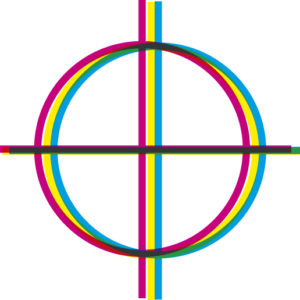
Trapping is the process of overlapping two inks (whether spot or process CMYK) into each other eliminating misregistration of colours on the printing press. Look very closely and you’ll see it everywhere on printed material. The golden rule is that the darker colour holds its shape and the lighter colour ‘traps’ into that shape. Trapping avoids any white shapes showing in between colours when inks are slightly out of register. ‘Registration’ is making sure each ink sits exactly over the top of each other and that each ink is registered with each other.

Trapping amounts vary depending on the quality of the printing press, the substrate or paper stocks used and the speed of the printing press. The faster the speed the more chance of the inks falling out of registration with each other as the sheets move through the press. It can be as thin as strokes 0.2 of a millimeter or as thick as 2mm. Your printer will set their preferred trapping amounts.

Registration Marks

The Registration marks hidden in the flaps of packaging show the accuracy of the print work and whether any colours are out of line with each other.

Use a Lupe magnifying glass to really get a good look. Printers usually have swatches of Spot and Process colours near them so they can check the colour accuracy of the inks as well.


This example shows the misregistered blue ink leaving a white gap from the grey shape.

Printers eliminate this by trapping one colour into another. When inks are not trapped into one other they are called ‘butting’ colours (where one colours butts against another).


Trap 1 Overprint

One solution (particularly for very fine type) is to ‘overprint’ the grey onto the blue background.

This eliminates any white ‘ghosting’ that may occur but does change the colour of the overprinting colour as it adds the base colour to the top colour.


Overprinting cannot be avoided with very small text.

The trapping amount would create a visually distracting effect and basically replicates the effect of overprinting.


Trap 1 Choke

Correct trapping of the blue into the grey shape allows the main shape to show through from the background.

It eliminates any chance of white paper showing if the printing plates are out of register and is as unnoticeable as possible to anybody looking at the printed piece.


Although trapping is usually the domain of printers and Pre Press houses it is an important element for Graphic Designers to consider when designing printed material since it will change the colours of artwork if darker colours need to be overprinted on lighter colours or effects like white keyline strokes are needed to stop colors butting or trapping together.

Things to remember:

  • Darker colours hold their shape.
  • Light Colours spread under (choke) darker colours.
  • Spot PMS colours will always need trapping into Process CMYK colours.
  • Metallic Inks are opaque so all other inks will choke under them.