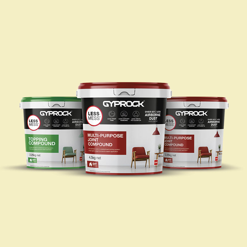
Gyprock Less Mess
Packaging Design
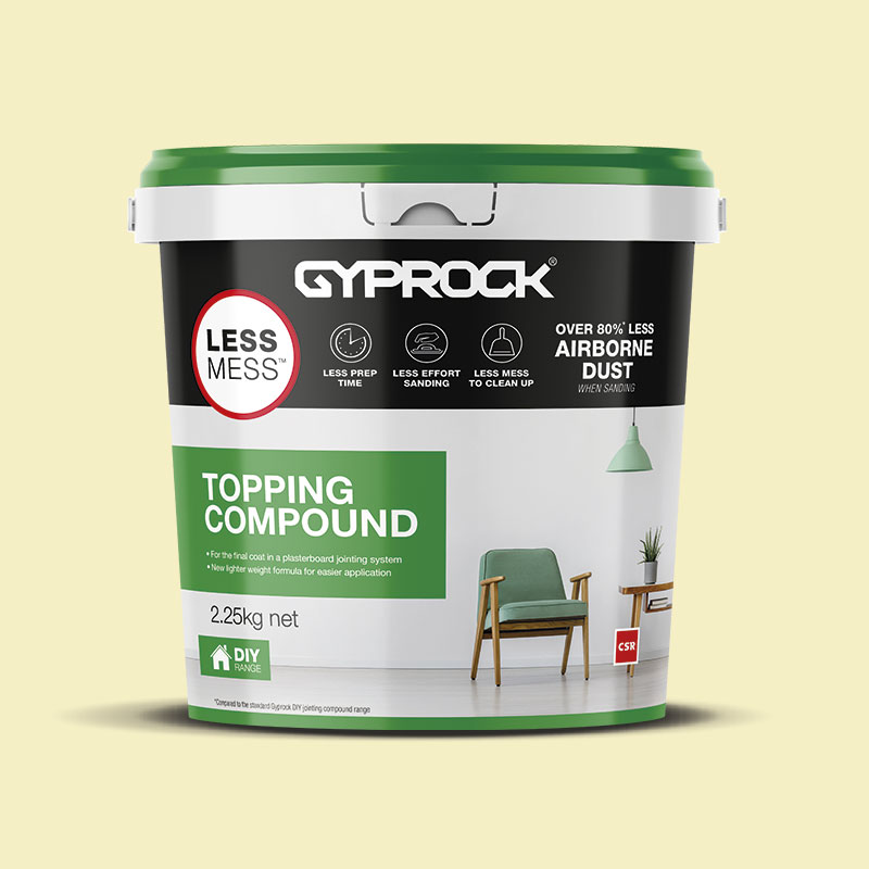
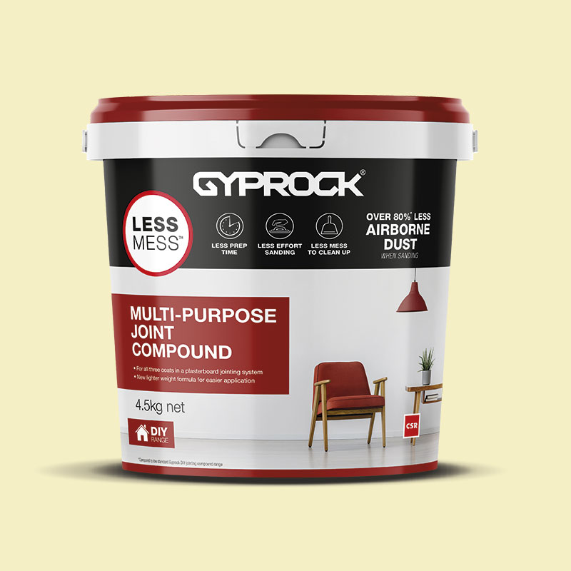
Gyprock was ready to launch a new ‘Less Mess’ formula on 3 existing SKUs and called on APR to get the job done. With an open brief of wanting to move away from their current design, APR created a new look and feel, keeping it modern and fresh, anchoring the Gyprock brand in black while still maintaining the colour coding to help consumers identify the products instore. As part of the launch of Less Mess, APR were also asked to create an ad campaign that ran in the Bunnings magazine for 3 months to communicate the benefit of the new formula – Less Mess!.
Deliverables
- Packaging Design
- Ad Campaign


